


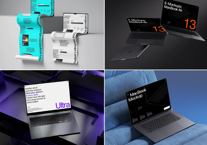
You spent three weeks polishing a dashboard, a landing page or a portfolio case. Then you dropped the screenshot into a flat gray rectangle and wondered why it looked like homework. The design was fine. The presentation was not. A screen on its own reads as raw material; a screen inside a well-chosen frame reads as a finished product.
Why the angle changes the story
A screenshot is a flat surface, but a laptop is an object with weight, edges and a place in someone’s daily life. The angle you pick tells viewers how to feel before they read a single word on the screen. Straight-on says “judge the product on its own terms”. A tilted view says “here is the experience of using it”. Choosing a laptop mockup file is the easy part; choosing the right angle is where projects are won or lost.
Five angles, five personalities
1. Front view: the honest one
The screen faces the viewer almost head-on, with very little perspective distortion. Text stays legible and proportions stay true, which is why documentation pages, UI kits and app store screenshots default to it. When the point is to prove what’s on the display, not to impress with hardware, front view wins.
2. Three-quarter view: the storyteller
The laptop turns 30 to 45 degrees, so you see both the screen and the keyboard deck. This is the classic hero shot on SaaS homepages and Product Hunt banners, because it feels dimensional and photographic while still keeping the interface readable enough to sell the product at a glance.
3. Top-down flat lay: the workspace
Shot from directly above, the laptop sits among a notebook, a coffee cup and a phone. Freelancers and agencies reach for this one on Instagram and Behance, since it looks like a real desk mid-workday rather than a sterile render.
4. Low angle: the hero
The camera sits near desk height and looks slightly upward at the screen. The device feels large and confident, which suits product launches, event banners, Kickstarter pages and any rebrand that wants to feel bold.
5. Side profile: the minimalist
Here you see the thin edge of the lid and the hinge rather than the display itself. It works when the hardware’s thinness is part of the message, or when the layout needs a calm composition with room around a headline.
How to choose without guessing
Ask three questions before you even open a design file.



- What must be readable? If the audience needs to read the interface, go front or three-quarter. If the goal is mood over detail, go low angle or side profile.
- Where will the image live? A website header needs open space for a headline, a phone feed favors square crops, and a slide deck needs a clean background behind the device.
- What is the tone of the brand? Playful, consumer brands can handle dramatic tilts. Banks, law firms and B2B tools read as more credible with restraint and a near-frontal angle.
A quick check helps: shrink the mockup to thumbnail size. If you can still tell what’s shown, the angle is doing its job.
Where laptop mockups already earn their keep
Look around and you’ll notice them everywhere design work gets shown to someone who isn’t a designer.
Product Hunt launch galleries are packed with app screens inside laptop frames, because a bare screenshot rarely stops a scroll.
Designers on Dribbble and Behance present web projects the same way, since clients grasp a site faster on a device than as a flat image.
Agencies pitching a redesign drop the client’s homepage into a mockup before the meeting, so the founder can picture the result on their own desk.
Course creators do the same with platform screens on a sales page cover, since it signals “this is a real, working product,” not a concept.
The pattern is simple: a device makes an abstract interface feel like something tangible you could own tomorrow. That’s why a library like ls.graphics organizes its mockups by device type and angle, so you spend minutes picking the right shot instead of hours setting up lighting and perspective from scratch.
Small details that make it look real
The angle gets attention, but small touches decide whether a viewer keeps looking or scrolls past.
- Match the screen’s brightness to the surrounding scene; a glowing white screen in a dim room reads as pasted-in.
- Keep the screenshot sharp at export size; a blurry image inside a crisp frame kills trust fast.
- Stick to one device style and one angle per composition, rather than stacking several mockups into one crowded image.
None of this takes skill, just a second pass before export.
The takeaway worth remembering
Angles aren’t decoration, they’re direction. Front view informs, three-quarter view sells, flat lay humanizes, low angle impresses, and side profile refines a quiet layout. Match the angle to what the image needs to do — inform, persuade, or set a mood — test it at thumbnail size before you commit, and let the laptop carry the storytelling weight a bare screenshot never could on its own. Your next project deserves better than a gray rectangle on a white background.